 |
Fried-Cassorla Communications, Inc.
Imaginative Direct Marketing and Advertising
7408 Woodlawn Avenue, Melrose Park, PA 19027
Phone: (215) 635-5189 Fax: (215) 635-0461 e-mail: albert@fried-cas.com
Discover resources for marketers! Visit http://www.fried-cas.com |
How to Build an Effective,
Sales-Oriented Web Site
By Albert Fried-Cassorla
Table of Contents:
(Note that contents were designed for print publicatiion and pages
do not coordinate with web print-outs.)
| Item: |
Page: |
| Executive Summary |
5 |
| Challenges and Approaches of This Report |
6 |
| Current Sales and Traffic Background |
7 |
| Recommendations for improving sales, increasing traffic and
improving navigation |
11 |
| #1: Use cross-selling and up-selling techniques extensively
and sensitively. |
11 |
| #2: Adopt an attractive, consistent appearance throughout
the site. |
13 |
| #3: Use a navigation bar throughout the site. |
14 |
| #4: Promote your web site from within, via special offers,
contests, coupons, sales and other techniques. |
16 |
| #5: Add a scrolling news board to the home page. |
17 |
| #6: Add a secure sign-in for relevant news and special offers. |
19 |
| #7: Use a double or triple column layout. |
20 |
| #8: Add a search engine to the home page. |
21 |
| #9: Make customer service more accessible by providing links
to a support desk on every page, and through other means. |
22 |
| #10: Add a "Click here to speak to a representative"
button. |
23 |
| #11: Use well-positioned banners on all web pages. |
24 |
| #12: Consider using a changing banner
(animated GIF) |
25 |
| #13: Give the ABC COMPANY store its own tag line. |
26 |
| #14: Use a strong network of internal links to expedite the
search process. |
27 |
| #15: Get your customers’ e-mail addresses and use them. |
28 |
| #16: Use graphic devices to make sales messages more compelling. |
29 |
| #17: Some observations made when placing an actual order. |
30 |
| #18: Add a brief survey to the store: |
32 |
| |
|
Best practices web site analysis:
Grainger – www.grainger.com |
34 |
Best practices web site analysis:
Thomas Register – www.thomasregister.com |
35 |
Best practices web site analysis:
The American Psychological Association - www.apa.org |
36 |
Best practices web site analysis:
Barnes and Noble www.bn.com |
37 |
Best practices web site analysis:
Electronic Engineers Master Online – www.eemonline.com |
38 |
Best practices web site analysis:
The Franklin Institute Science Museum www.fi.edu (The Franklin Institute Online) |
39 |
Best practices web site analysis:
VerticalNet www.VerticalNet.com |
40 |
Best practices web site analysis:
Amazom.com |
41 |
Best practices web site analysis:
U.S. Pharmacopeia – www.usp.org |
42 |
Summary
Many firms have the advantage of possessing
a web site that sells products and services at a respectable volume.
However, opportunities abound to elevate the current operation and set
of experiences to the next level of effectiveness.
Contained in this report are recommendations to remedy common problems.
When viewed in toto, call for:
- Streamlining and easing the navigation process
- Capitalizing on selling opportunities during the pre-purchasing
and purchasing processes
- Enhancing the relevance and return-visit value of the site visiting
and shopping experiences through various enrichment measures
Our recommendations are further summarized in the Table of Contents,
which reprises their titles.
If these recommendations are implemented on your site or that of your
client's you're involved with, we believe that the net results will be higher
sales and an increased level of service delivered.
Challenges and Approaches: Web Site Analysis and
Report
Outbound e-mail
Outbound e-mail is a very powerful tool in direct marketing.
However, it is so powerful that it requires its own article or chapter.
In synopsis, outbound e-mail tires into web sites in
several ways:
- As confirmation of an order
- As a thank-you for a sign-up or other action taken
at the site
- As targeted messages (sales, content, customer service
or all) designed to increase sales, traffic and stickiness (web loyalty)
Recommendations for improving sales, increasing traffic
and improving navigation:
Recommendation # 1
Use cross-selling and up-selling techniques extensively
and sensitively.
Cross-selling should be geared to the sensitivity of web customers and
be as unobtrusive as possible.
Have suggested additional purchases feed off a database based on
actual purchasing history of other customers. If other customers
have expressed an interest in product X, then suggest products Y and Z.
An intuitive, hand-matched cross-selling system will quickly prove
too labor-intensive and should be avoided. In other words, try to avoid
the temptation to use a hand-made matching system.
Cross-selling works best when it makes a suggestion. It’s a soft
sell approach that capitalizes on a buying opportunity. Cross-selling can
also be pointing out a similar product, providing a source for additional
information, analyzing previous purchases or simply making a recommendation.
("May we suggest…," "Others have purchased…"
and so on.)
ABC COMPANY Online could benefit from cross–selling messages:
"Save on CD-ROM," "Order WebDoxx and Save," etc. They
can be implemented in Store or on the Ordering page. And this is a great
opportunity to suggest an upgrade:
UPGRADE FROM Product X TO Product Y!
Click here for more information
Cross-selling messages can utilize the name/profession of ABC COMPANY
Online customers (ENGINEERS, ARCHITECTS, etc.) and induce further selling
with strong words like SAVE, FREE, JOIN NOW, SPECIAL.
Follow-up pages or messages are a useful method for cross-selling.
Once a customer has inquired about a certain product, or begun to buy that
product, then follow-up page or message presents a similar or complementary
product.
Follow-up pages do not need to be exclusively devoted to the cross-sell.
If they are, it could be viewed by the customer as an intrusion. Follow-up
messages may be embedded in the next instruction page.
Call-out boxes are a great way to highlight important content
and add "bells and whistles effect" to web site. This also increases
interactivity.
Amazon.com utilizes cross selling at every opportunity. They use
the phrase "Customers who bought this book also enjoyed…."
Barnes and Noble practice the same selling approach by suggesting customers
search for other titles by the same author.
When the American Psychological Association sells industry books
they add on the cross-sell "You may also be interested in….."
This approach employs a soft approach that doesn’t turn-off the customer.
This may be the ideal, non-intrusive approach to take with busy ABC COMPANY
customers.
Recommendation # 2
Adopt an attractive, consistent appearance throughout
the site.
A consistent, attractive, and functional look to the site will help to
make it more successful in many ways. Your firm's branding will also benefit
from a consistent look and message across the site.
The consistent look we recommend may be achieved to some extent through
the use of a navigation bar, our next recommendation. Another method is
the adoption of consistent graphic standards for various elements, such
as body copy, headlines, subheads, links, buttons, etc.
Recommendation # 3
Use a navigation bar throughout the site.
A constant navigation bar allows the browser immediate access to pertinent
links and increases interactivity between site and customer. Customers like
to know where they are and sometimes how to get back to where they came
from, especially when dealing with complex Standards materials.
L-shaped: An L-shaped navigation bar offers room for continuing company
presence and branding, special messages, and major navigational categories.
However, it does take up considerable screen space.
Examples of L-shaped bars include:
Another typical navigation scheme is a navigation bar with graphic icons
that hyperlink to a content section.
Navigation bars may also be horizontal or vertical only.
Visit www.amazon.com and you’ll
get an idea of how Amazon uses their navigation bar as a highly visible
file, categorized for easy access.
Recommendation # 4
Promote your web site from within, via special offers,
contests, coupons, sales and other techniques.
Promotion generates repeat traffic. Special offers, contests, coupons,
sales, special "tip" of the month, special offer of the month,
even trivia make the web site more interesting and keep customers coming
back.
Finding the right promotions for ABC COMPANY will be the great
challenge. Any promotions right now would be innovative.
Pose a question (How many Standards are there in our CD-ROM package?)
and offer an incentive to "Click on". (Guess correctly and receive
a free month of new Standard updates.)
Offer FREE STUFF, but make the offer prominent. (Get a FREE gift by becoming
an ABC COMPANY Online member today.)
Offer sign-up and e-mail incentives with promotional items. (Example:
a key chain with the ABC COMPANY logo)
Other suggested features for involvement with the ABC COMPANY web site:
- Standards question of the week (Mention who it’s from, their title
and company name)
- Ask the Standards Expert
- Standard Information You Should Know etc.(You get the idea.)
Recommendation # 5
Add a scrolling news board to the home page.
This will increase log-ons to the home page, to the site in general,
and increase sales if properly used.
People will want to see what is new… and ABC COMPANY can promote
sales of new services and products there. Also new features of the web site
may be promoted there.
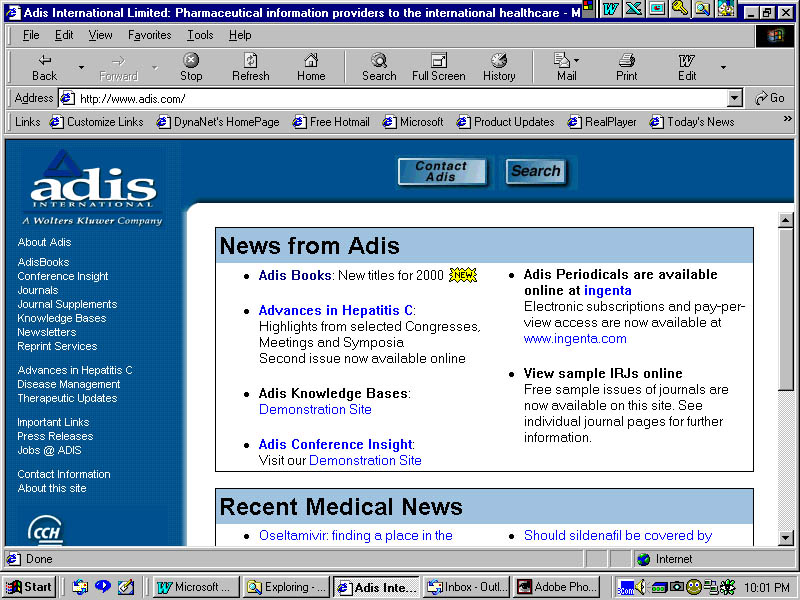
For an excellent example of a news board, visit Scott-Levin's site. This
company serves the pharmaceutical industry with research studies.
http://www.scottlevin.com/index.cfm.
Notice how the scrolling message appears in a discrete section of the
home page, not dominating it. If ABC COMPANY were to employ a similar technique,
its messages could be shorter and pithier, and therefore more effective.
Examples might be:
Currently, to access news (and sales messages) an ABC COMPANY customer
has to click 4 screens deep into the site.
By the way, the oldest ABC COMPANY News Release information is presented
at the top of the column, which is not the way most people want to access
info. In general, people prefer to access freshest news first.
Also, most other PR sites offer visitors a capsule summary of the news
release's content. In April, 2000, many releases are piled one after the
other on one long page that requires wading through.
"News" on the home page can include sales-related features,
as we suggested. But even deeper into the News section, items on sale can
help generate sales. After all, many of the releases are ABOUT saleable
items.
Recommendation # 6
Add a secure sign-in for relevant news and special offers.
ABC COMPANY can distinguish among casual visitors, registered visitors
and members. Registered visitors may qualify to access certain areas not
available to casual visitors. To be registered, a visitor may need to complete
a simple form asking for contact information, or simply remember a password.
Members should qualify for a more in-depth and valuable level of benefits.
Of course, the reason to implement such a system would be to sell more.
Registered users would buy more if they got customized web pages, better
deals, relevant recommendations, or a deeper level of access. If they do
not receive those benefits, registration could be an impediment to sales.
Approaches:
Amazon uses this phrase at the top of the page: " Hello.
Already a customer? Sign
in to get recommendations. "
ABC COMPANY can use a phrase like this:
"
Hello. Are you a registered visitor? Sign in
to get relevant news and recommendations. "
Recommendation # 7
Use a double or triple column layout.
Many sites use a triple column layout, which afford the placement of
relevant information beyond what the visitor directly seeks. This has the
advantage of allowing ABC COMPANY to suggest and sell more via banners,
hot links and other methods.
Typically, a triple-column layout has one narrow column on the left,
a larger central column and a second narrow column on the right. If a navigation
bar is employed, this would account for one of the columns.
For reference, an Amazon screen is provided below, showing the 3 columns.
Note that I believe this screen and approach is too commercial and "messy"
for ABC COMPANY's use as a home page model. However, some elements merit
emulation.
Recommendation # 8
Add a search engine to the home page.
This will expedite the Standards search process and simplify navigation
– a major concern of on-line purchasers.
A simple phrase, such as: "What are you looking for?" is a
welcome sight for hurried or bleary-eyed browsers. A search engine on the
subsequent products page will continue to narrow the search process and
contribute to a positive on-line experience.
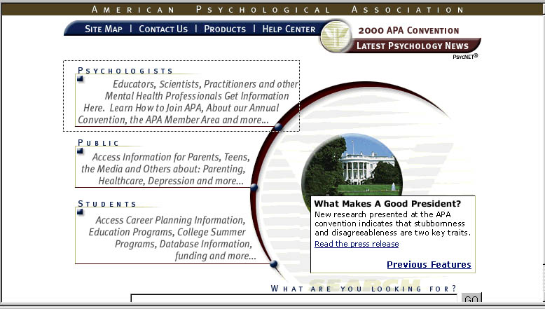
An useful example of appropriately placed search engines can be found
on the American Psychological Association’s web site at www.apa.org
(See screen capture below. Also note the 3 categories for entrance. Perhaps
ABC COMPANY could use: Members, Registered Users and Visitors)
Recommendation # 9
Make customer service accessible by providing links
to a support desk on every page, and through other means.
The best rule of thumb is to make all of the necessary information available
to your customer. Answer your customer’s questions with clear, comprehensive
content. But inevitably, questions will arise.
Highlight the customer service/support desk on every page. On
most pages support was listed at the bottom of the page and on others, it
was listed at the top. The continuity of this customer service feature makes
it easier for your customers to find you.
We also suggest you make phone numbers available in case of questions
or if a more person-to-person contact is preferred. Putting pictures of
ABC COMPANY support staff would put a "human face" online, reminding
your customers that they are dealing with real people.
Recommendation # 10
Add a "Click here to speak to A representative"
button.
These buttons are becoming more common. They do require an investment
in support, whether handled internally or externally. With these buttons,
the customer enters his or her phone number, and ABC COMPANY or its vendor
would call the customer back.
Although you might think that an 800 number suits the same needs, it
turns out that a significant proportion of customers prefers to be called.
Recommendation # 11
Use well-positioned banners on all web pages.
A well-placed headline banner creates awareness to branding, specific
products, service, sales and serves as a great "in-house" advertising
tool.
Think of what you want to tell people that will fit in the introductory
banner. (Company name and benefit works best). Banners are the first thing
the web visitor sees, so make the first impression a memorable one.
A pulsing, colorful ABC COMPANY logo will prove more effective and catchy
than stationary one.
Recommendation # 12
Consider using a changing banner (animated GIF)
Animated GIFs work by alternating various messages. A low byte message
rotates various small-space images to create an animated effect.
Although you have probably seen them before, for an example visit http://www.phillynews.com
and see the Phillynews.com games ad.
Potential alternating messages could include (these are slogans suggested
here just as ideas):
Technical Standards for industry worldwide
Technical Standards at work worldwide
Technical Standards for international industry
Become an ABC COMPANY member today and save!
OR
Each message would have different, appropriate imagery.
Recommendation # 13
Give the ABC COMPANY store its own tag line.
The tag line would give the store a special sales and service orientation,
which would in turn help increase sales.
Example:
ABC COMPANY store
Serving your technical needs 24 hours a day
or
Welcome to the ABC COMPANY Online Store.
Eg. ABC COMPANY Individual Standards Search
Blinking banner: Search for an Individual ABC COMPANY Standard (alternate)
Find out what quality Standards are all about! (Use an eye-catching
graphic like binoculars)
If applicable, offer excerpts from Standards. Don’t assume that
every Standard has to feature an excerpt… most important, best-selling,
highest profit-margin items only.
VerticalNet (www.VerticalNet.com)
places pulsing banners/ad displays in each specific vertical site,
focusing on features/specials of each site.
Animated banners work better than static ones. Bright colors and blue
borders are effective -- even on static banners.
The use of a single animated banner can be effective and judicious. One
example may be found at www.msn.com.
At the time of this writing, they were offering free MSN messaging
service in a 3-banner animated GIF. It added movement to the page, while
avoiding a cluttered look.
Another example is shown by www.philly.com.
There, a three-framed animated GIF touts the three ways in which that site
enables visitors to access information.
Recommendation # 14
Use a strong network of internal links to expedite the
search process.
The purpose of a link is to hold your attention and effectively communicate
its message to you. Then it’s on to other similar/appropriate links
– smoothly and quickly. Suggested for ABC COMPANY Online: Links should
be underlined, in plain text, and appear on the browser as a different color
than the rest of the text. This contributes to ease of Navigation.
(See navigation bar and layout recommendations elsewhere in this
document, which covers some similar ground.)
Once again VerticalNet leads the way in B2B linkage. The VerticalNet
site called www.ProfessionalStore.com
provides links to over 40 industries, featured product descriptions
(e.g. Featured Books), links to company related articles (Newsletter, News
and Events, e-mail, and information requests.)
ABC COMPANY links can be activated through movement/animation or simply
made more appealing through color and font size. E-mail links and corporate
information should be prominently displayed.
Recommendation # 15
Get your customers’ e-mail addresses and use them.
Start collecting e-mail addresses and other key data points and start
building upon your own opt-in database. Right now, it appears that the ABC
COMPANY web site does little or nothing to capture casual visitors' e-mail
addresses. This can contribute to a loss of sales.
Use collected e-mail addresses to distribute newsletters, promotional
materials, announce new standards, modifications, ask for feedback, send
a reminder ( Have you read any best-selling Standards lately?) Personalize
e-mail when possible. Ask for more pertinent information in e-mail confirmation.
This can manifest itself in a feedback page, an e-mail sign in (offer
an incentive) or take for example Amazon.com. They have E-Mail Recommendations.
Choose from topic/book/product (Standards in the case of ABC COMPANY) and
receive regular e-mail updates from experts!
Offer incentives for customers to provide their e-mail addresses.
E-mail addresses can be your gold. However, most people get too much e-mail
already. Incentives can include:
- A discount on a next purchase.
- A particular, popular item, free.
- Admission to a restricted area of the site for valuable content.
- A chance to participate in a drawing.
Also, e-mail is a great way to get customer testimonials that speak volumes
about your product. Or have customers e-mail ABC COMPANY with their questions.
If possible, offer a 24 hour reply. This could stimulate a sale immediately
or in the future.
Recommendation # 16
Use graphic devices to make sales messages more compelling.
One photograph instead of a collage may be illustrating international/
worldwide aspect of the company, e.g. ABC COMPANY wrapped around a spinning
globe with various specs shaded in the background.
Entice the visitor to "click on" ABC COMPANY Store with:
Maybe change bullets to little spinning globes (for a work or international
motif)
Recommendation # 17
Some observations made when placing an actual order.
Suggest incorporating products and order services.
"Order PDF now" should be an option at the bottom of a Standard
or other product description. Likewise, "Order Fax now" etc. Following
that choice…
Ordering Info should have its own page. When the customer
clicks on an item, they should go to something called an Order Page. Right
now, they go to "Select Geography."
From there, they go to a page called "Your Shopping
Cart Currently Contains:"
All of these pages should be part of an Order Page, whether one big one
or a series of pages within the Order Page context.
Check out
(If you have a OneClick-type checkout system):
Are people aware of OneClick Checkout? OneClick Checkout should be featured
on every page. Specify that ordering will be easier the next time around.
After order has been placed, thank the customer and assure them of ABC
COMPANY’s customer appreciation. ("Thank you for your order. Are
you satisfied with your online experience? Let us know.")
The following is an example of some content of a Thank-You type of page:
_____________________________________________________________
[art: screened back shot of professional looking people smiling
at the visitor]
Thank you for your order!
We hope that you will be completely
pleased with [name of product]. It will be shipped in X days. (Or,
it has been sent via PDF etc.) Let us know if we can help you in any way.
In the meantime, you may want to explore other products
often purchased by buyers of [name of product], Product ABC and Product XYZ. Also consider the advantages
of joining ABC COMPANY. Just click on Membership to the left.
Once again, we appreciate your order and look forward to
your next visit to the ABC COMPANY web site!
The staff
at ABC COMPANY
_____________________________________________________________
Other purchasing sequence ideas:
Remind customers that if they provide you with their fax number, they
will not receive unsolicited faxes.
Also remind customers that they can save Standards provided as PDF's
to their hard drive (give instructions on the spot rather than on the ordering
page). A courtesy message here would be appropriate.
Recommendation # 18
Add a brief survey to your store:
To acquire more customer knowledge, albeit at a surface level, ask questions
right on the store page. Invite customers to take a survey. First do it
without incentives. If no one tries it, add incentives such as 10% discount
or a Gift Certificate.
Limit the survey to perhaps 3 questions to keep it quick and easy to
participate in. These questions can be refined as time goes on. People can
be invited into sample zones to express opinions on new approaches, techniques,
graphics. A questionnaire should be quantifiable, for easily analyzable
results. A sample 3-Questionnaire might include the following:
Survey Questions:
- How would you feel about a pop-up or call-out to make
you aware of similar Products or of an updated Product?
| Mind a lot |
Would be a minor annoyance |
Indifferent |
Sounds like a good idea |
Sounds like an excellent idea! |
| 1 |
2 |
3 |
4 |
5 |
- How would you feel about receiving e-mail
updates and reminders on new Products and ABC COMPANY sales and special
offers?
| Mind a lot |
Would be a minor annoyance |
Indifferent |
Sounds like a good idea |
Sounds like an excellent idea! |
| 1 |
2 |
3 |
4 |
5 |
- How would you rate your ABC COMPANY Online
experience as compared to other sites?
| Very poor |
An unsatisfying experience |
OK |
A good, interesting site |
Excellent site - gives me what I need and more! |
| 1 |
2 |
3 |
4 |
5 |
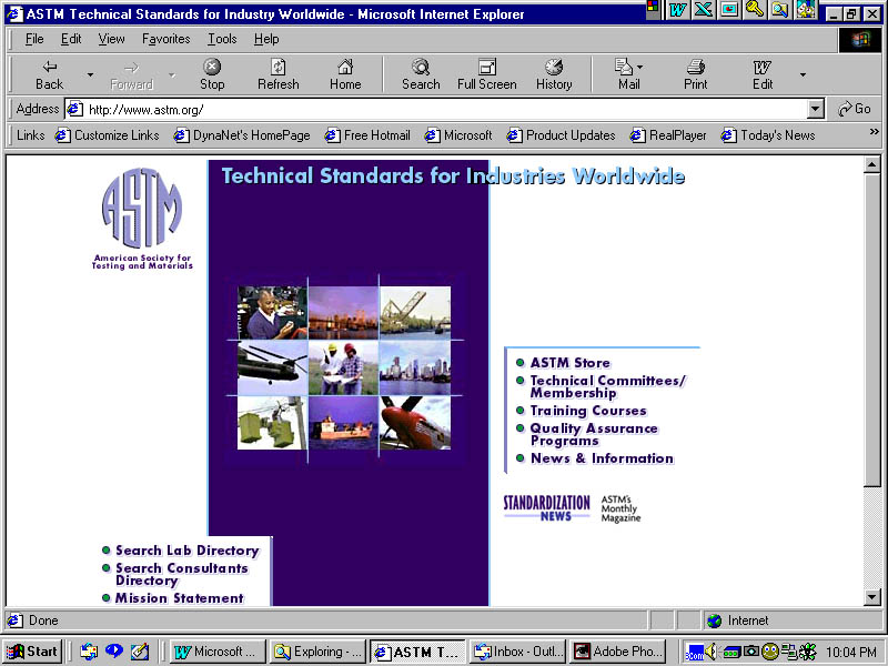
Grainger – www.grainger.com
Best practices web site analysis
Home Page:
Personalized in any way? Log-ins for members? |
Click on bar for registered customers.
Click on bar for new customers. |
Home Page:
Is the store present or one click away? Any inducements to visit the
store or buy? |
Monthly specials are featured prominently on home page giving browser a
quick reference point to sales highlights. Hyper text featured in copy allows
shortcut to more detailed information |
Home Page:
Any movement or animation? |
Pulsing banner offers FREE tool for ordering over $275 in merchandise.
Blinking sales tag gif (revealing product) draws attention to discounted
products. |
Store Page:
Any inducements to buy?
Cross-selling or suggestions?
Ease of ordering? |
Weakness: Doesn’t give clear cut directions to store. Home page
is filled with useful buying information but fails to clearly direct buyer
to storefront.
Catalog features easy product search called Advanced Search and product
proximity categories called Match Makers. ABC COMPANY could adopt these
search organizers under such banners as (for example;) Specific Standards
now, EZ Standards search, ABC COMPANY quik find, etc.(See home page Recommendation
#3)
Buttons for registered users and new users allows for expeditious shopping
for members and allows new customers to sign up in two easy steps. |
Thomas Register – www.thomasregister.com
Best practices web site analysis
Home Page:
Personalized in any way?
Log-ins for members? |
Comments:
Search engine (search A-Z) prominent on home page. Find It by product
or group of words. No personalization. |
Home Page:
Is the store present or one click away? Any inducements to visit the
store or buy? |
Store is not plainly visible. Color scheme is poor, distorts navigation
icons. Absence of rollovers contributes to overall dullness of site. Does
not tell you what the site is about or useful for - jumps into buying. |
Home Page:
Any movement or animation? |
Blinking/Pulsing stats tell numerical story: number of companies, products,
CAD drawings, catalogs, etc, Eye-catching, but not sales prompting. |
Store Page:
Any inducements to buy?
Cross-selling or suggestions?
Ease of ordering? |
No real inducement to buy. There is a noticeable Free Membership placed
at extreme bottom of home page.
Will not allow browsing without membership information. |
The American Psychological Association - www.apa.org
Best practices web site analysis
Home Page:
Personalized in any way?
Log-ins for members? |
Comments:
Navigation bar is concise with only 4 options: Site map, contact us,
products, and help center
Short cut hyper text addresses fellow psychologists and professionals,
students, and public instantly narrowing target audience into a specific
group. |
Home Page:
Is the store present or one click away? Any inducements to visit the
store or buy? |
Home page search engine asks, "What are you looking for?" |
Home Page:
Any movement or animation? |
Stationary |
Store Page:
Any inducements to buy?
Cross-selling or suggestions?
Ease of ordering? |
Inducement to buy includes a special members/affiliate price
Product section features synopsis on product (eg. book) and the cross-sell:
"You may also be interested in (names of similar books) "
Easily identifiable check out icon brings up order form. |
Barnes and Noble www.bn.com
Best practices web site analysis
Home Page:
Personalized in any way?
Log-ins for members? |
Comments:
Surprisingly, no personalization
Returning customer sign-in at bottom of home page (a misplacement) |
Home Page:
Is the store present or one click away? Any inducements to visit the
store or buy? |
Store is listed immediately in browse bar (one click away).
Sales and specials serve as an inducement to buy as well as customer
ratings. |
Home Page:
Any movement or animation? |
Movement: pulsing display ads, alternating between "save now",
"picks", and "attention". |
Store Page:
Any inducements to buy?
Cross-selling or suggestions?
Ease of ordering? |
Gif ad displays serve as colorful and active inducements to buy. Bright
colors and large font along with color photos of featured products gives
this sight "sales appeal".
Cross-sell is a soft sell. Tells of other areas to search for author/book.
(See store improvement suggestion # 3)
Quick check-out |
Electronic Engineers Master Online – www.eemonline.com
Best practices web site analysis
Home Page:
Personalized in any way?
Log-ins for members? |
Comments:
Hypertext highlights Register: for EEM user profile. (Good idea for a
database builder) |
Home Page:
Is the store present or one click away? Any inducements to visit the
store or buy? |
Navigation is kept simple by "Find Product" and "Find Manufacturers"
search bar |
Home Page:
Any movement or animation? |
Blinking Box: Highlights contests and trivia
(See store improvement suggestion # 4) |
Store Page:
Any inducements to buy?
Cross-selling or suggestions?
Ease of ordering? |
Not really a storefront but more of a search engine.
Museum store is hard to find.
No cross-selling. Simple order form. |
The Franklin Institute Science Museum www.fi.edu
(The Franklin Institute Online)
Best practices web site analysis
Home Page:
Personalized in any way?
Log-ins for members? |
Comments:
No personalization
Hypertext for mailing list at bottom of home page [ For information about
F.I. through e-mail box (monthly newsletter)
* no sign-up for membership info conspicuous by its absence
|
Home Page:
Is the store present or one click away? Any inducements to visit the
store or buy? |
Museum Store is two clicks away.
Price listed includes regular price as well member price. |
Home Page:
Any movement or animation? |
|
Store Page:
Any inducements to buy?
Cross-selling or suggestions?
Ease of ordering? |
Movement on Museum Store consists of rollovers that "pop-up"
with specific areas. Eg. Visit the Museum "pops-up"( layered submenus
thanks to DHTML) with:
Imax Theater
Fels Planetarium
Visit guides
Museum Store
Although store has limited selection, the copy is descriptive and useful.
Colorful product illustration is both effective and appealing.
Easy to fill out info form is followed by equally easy graph order form
(SKU)
Followed by short credit form info. Easiest of all sites to order from. |
VerticalNet www.VerticalNet.com
Best practices web site analysis
Home Page:
Personalized in any way? Log-ins for members? |
Vertically formatted home page contains no personalization/login |
Home Page:
Is the store present or one click away? Any inducements to visit the
store or buy? |
Storefront: one click away |
Home Page:
Any movement or animation? |
Blinking banners in each specific vertical site. Ad displays alternate
with messages.
(See Store Improvement Suggestion #1) |
Store Page:
Any inducements to buy?
Cross-selling or suggestions?
Ease of ordering? |
Eye-catching and inviting. Professionalstore.com in bold banner with
the tag "Industrial Strength Information Supermarket (strong selling
connotation)
VerticalNet sticks to the basics: Prominently displayed company logo
and links to other related sites (See store improvement suggestion # 2)
Easy browse and search categorized into:
type (media)
keyword (title, etc)
industry
|
www.Amazom.com
Best practices web site analysis
Home Page:
Personalized in any way? Log-ins for members? |
Sign-in Hypertext "to get recommendations"
No log-in but e-mail recommendations and e-mail sign-up (See store improvement
#3) |
Home Page:
Is the store present or one click away? Any inducements to visit the
store or buy? |
Storefront presence is felt right away.
Product search table and browser box takes you directly to product |
Home Page:
Any movement or animation? |
No movement, but content actually moves the sale along! |
Store Page:
Any inducements to buy?
Cross-selling* or suggestions?
Ease of ordering? |
Store page is filled with Editor’s suggestions, book synopsis, bargain
books, customer reviews – all serving as inducement to click on further.
Amazon is BIG on cross-selling (no sale goes without it!!) * See store
improvement Suggestion # 4
Ready to buy – add to cart on storefront |
U.S. Pharmacopeia – www.usp.org
Best practices web site analysis
Home Page:
Personalized in any way?
Log-ins for members? |
Comments:
No personalization. |
Home Page:
Is the store present or one click away? Any inducements to visit the
store or buy? |
Rollover effect changes browser bar for simple, yet effective effect.
Layered submenus duplicate browser bar –redundant!
An L-shaped navigation bar stays in place throughout a site visit. |
Home Page:
Any movement or animation? |
Animated GIF banner promoting new product. |
Store Page:
Any inducements to buy?
Cross-selling or suggestions?
Ease of ordering? |
No real active/interactive inducement to buy. No "Store" as
such, though products are sold.
Products are sold by a third party, whose contents are shown in a window.
Products are presented in color photos with a descriptive synopsis.
The most interesting aspects of this Web site are the Ordering Options
which include: On-line order form, phone, fax, and mail. The e-mail order
form is e-mailed to you. You then fax or mail the print out. |
End of Chapter